
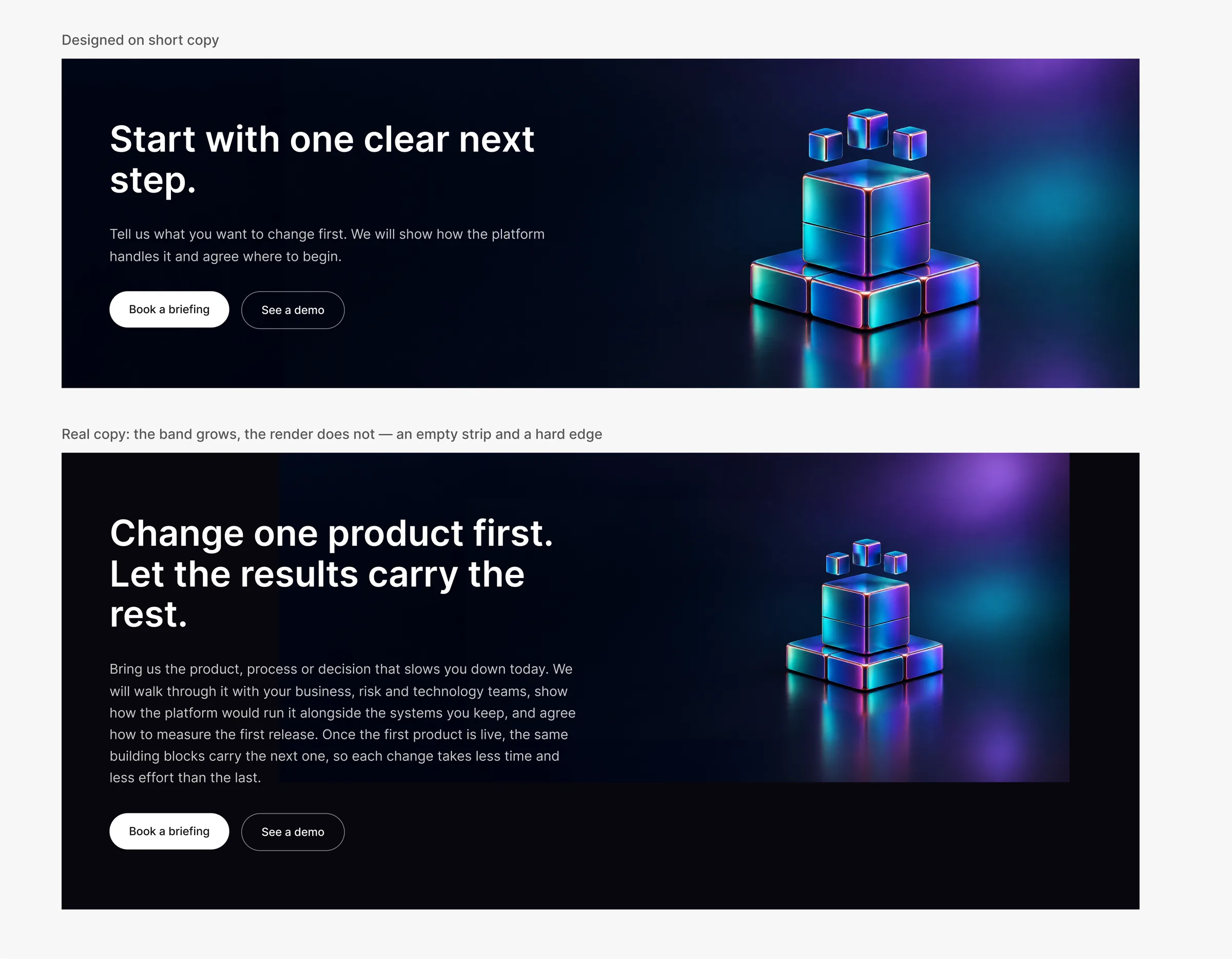
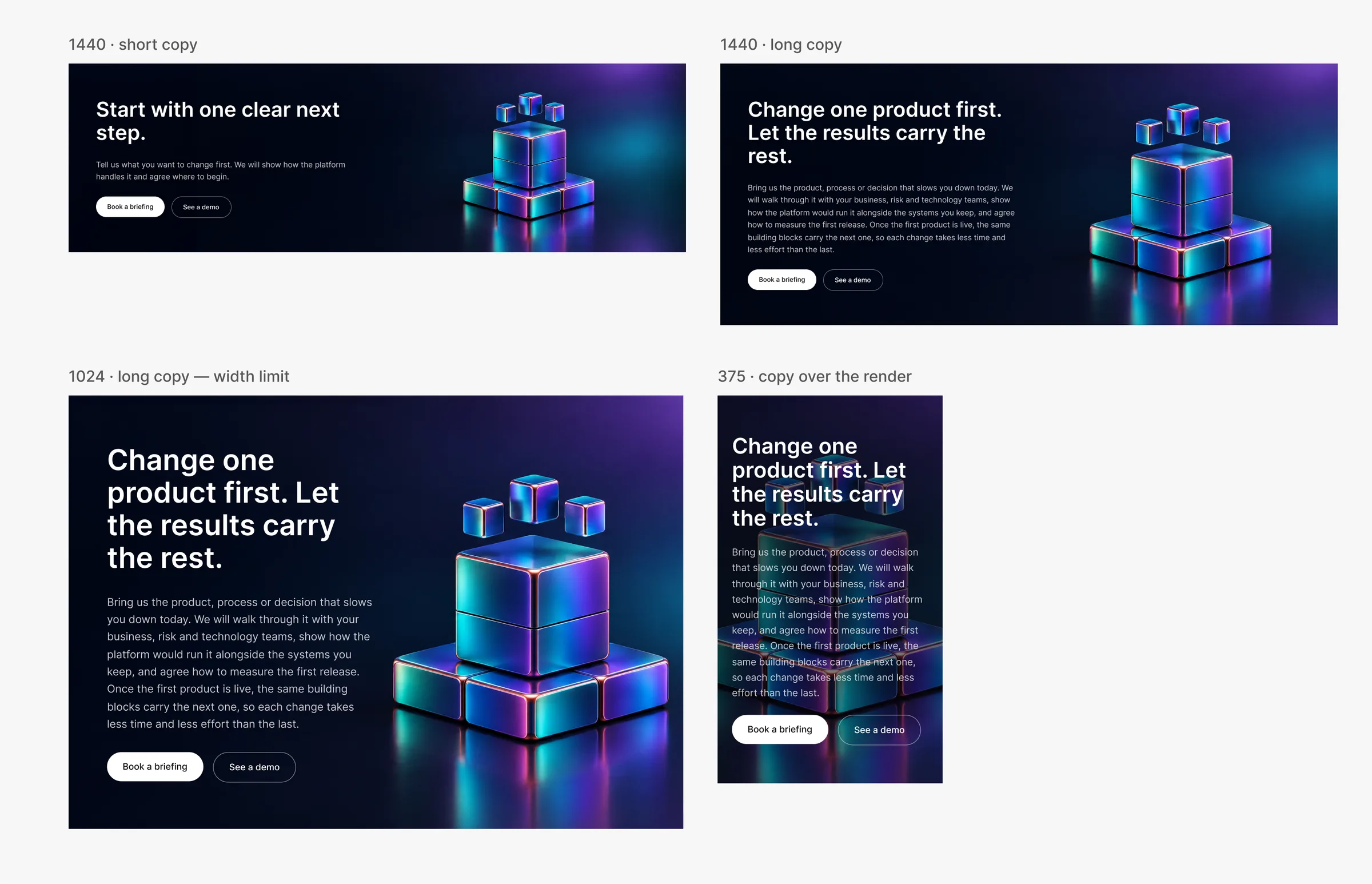
A closing banner sounds like the easiest block on a website: a title, a short paragraph, two buttons and a 3D render on the right. On a large B2B product site it appeared on 40+ pages. It was designed once, on one page, with short copy — and it broke everywhere else.
Real copy was longer, so the band grew taller. The render stayed the same size, an empty strip opened under it, and the developer had nothing to build against. The fix was not another mock-up. It was a rule that any page, any width and any future render would follow without a designer placing the object by hand.
This article is the process I use for this kind of problem. I set the principles, judged every composition and made each decision; an AI assistant (Claude) took the measuring, the arithmetic, the repetitive Figma work and the checks across every case. That split is the point of the method, not the tool.
The process in eight steps
1. Measure reality before designing anything
I did not start with “design the banner”. I started with an inventory of every real instance: the copy of every page, the band height at five breakpoints, which render each page uses. The assistant collected it into a table of 40+ pages × 5 widths, and the table explained the bug in one line: the design covered the shortest case only, while real bands were up to 50 % taller.
Rule for the designer: never design from the one example in the file. Define what “real” means — real content, character for character — and get the full inventory first.
2. Draw every real variant, not the happy path
Every variant then went into Figma from the design-system component — real copy, five widths, each render group — so the problem was visible on the canvas, not only in a table. The assistant built the frames; I reviewed them as a set.
3. Judge the composition yourself
This was the step where the work was decided, and it was decided by eye. The first proposals were technically correct and visually wrong. Scale the render with the band? The object grew under the text. Keep the render small at the bottom with a fade? A mask that looked cheap. Each option passed the numbers and failed the composition: the balance between the copy on the left and the object on the right was gone.
What moved the work forward was a principle I stated in plain words: the object stands in the centre of the free space, and its size follows that space. Then I fixed a few frames by hand to show what I meant — the position, the scale, the breathing room around the object. Later I made a second call of the same kind: no masks or fades on the render at all; if an image does not cover the band, the backdrop is extended instead of hidden.
Rule for the designer: give the principle, not just “move it left”, and show it on two or three frames. The assistant can generalise a principle. It cannot replace visual judgement.
4. Turn the corrections into a rule — and check it against every case
My corrections — positions, sizes, crops — were read back and turned into a rule with numbers:
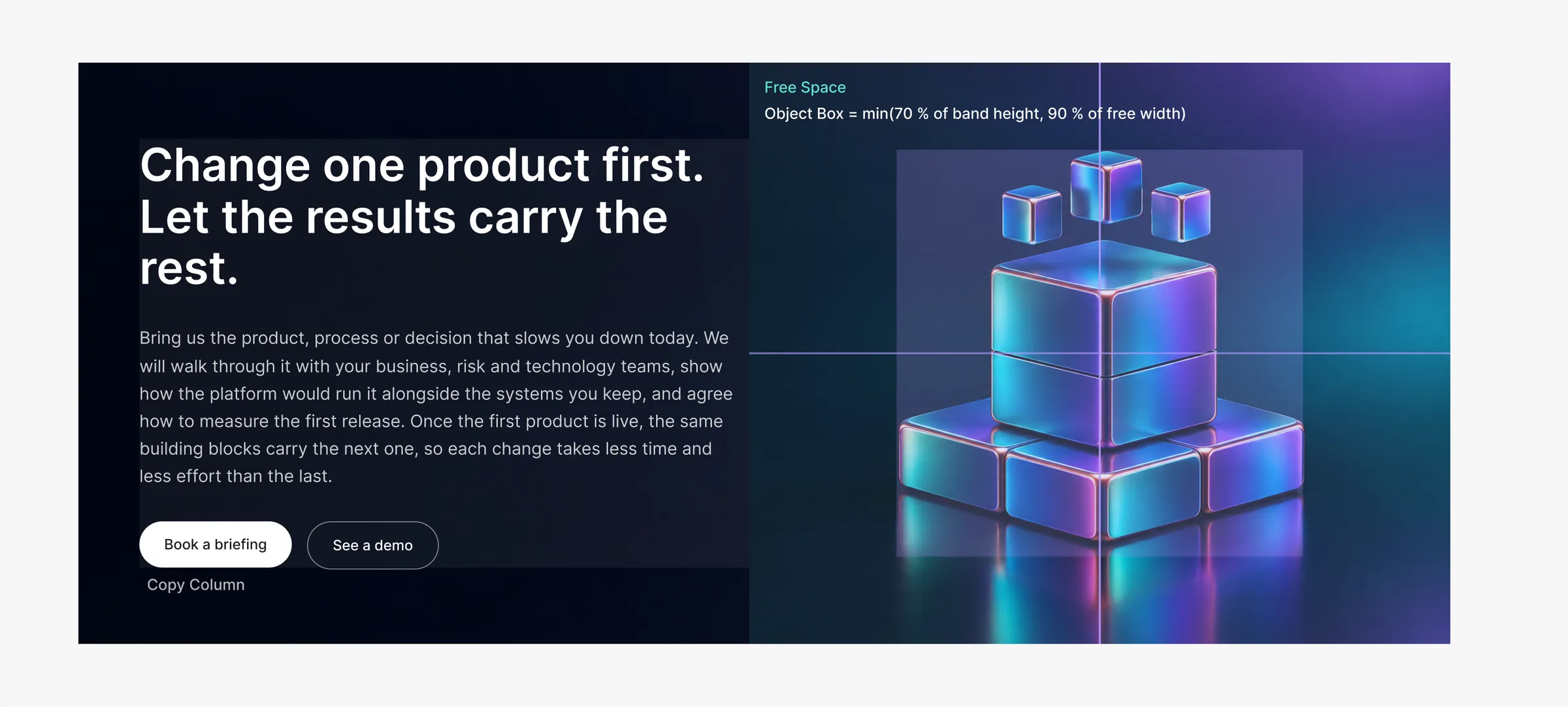
- the free space is the area right of the copy column, full band height;
- the object’s centre is the centre of that space, horizontally and vertically;
- its size is the smaller of 70 % of the band height and 90 % of the free-space width;
- the render must cover the band, so no image edge shows and no mask is needed.
Then came the step that people skip: checking the rule against all 40+ pages × 5 widths and listing where it fails. It failed at one breakpoint with long copy: wide objects ran under the text. That became part of the rule (the width limit), not a special case.
Rule for the designer: ask “where does this rule break?” and expect a list, not reassurance.
5. Standardise the asset, not the placement
Before the rule, every render had its own hand-tuned position at every breakpoint — thirty individual placements that only made sense to the person who set them, and that had to be redone whenever copy or an image changed. The rule replaced all of them with two things: one standard for the asset and one predictable placement formula.
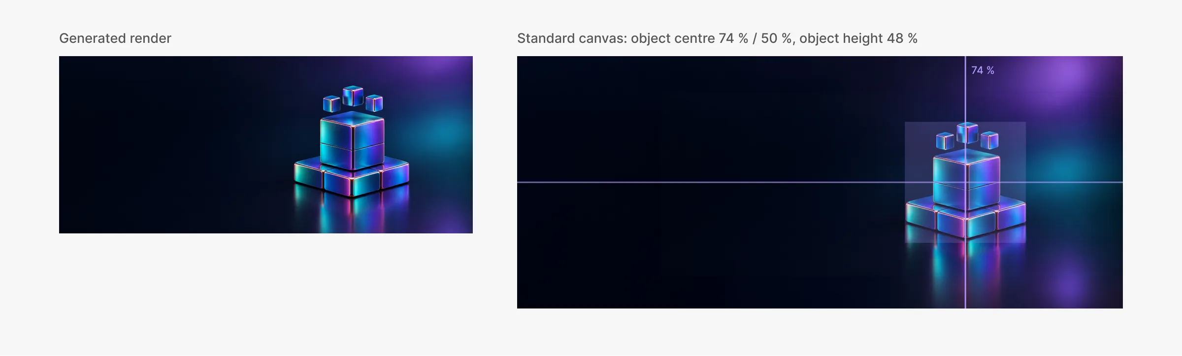
The first canvas template I was shown left the object small in a sea of empty backdrop; it covered every case on paper and was rejected on sight. The standard that stayed is banner-shaped: every render of a standing object is delivered on a 2.4 : 1 canvas, with the object’s centre at 74 % of the width and 50 % of the height, and the object 48 % of the canvas height. Existing renders were cropped to it; where the backdrop was too short it was extended with generative expand, and the original pixels were pasted back so the object itself was never regenerated.
The placement, written for developers. Inputs:
W— band width,H— band height (px);C— right edge of the copy column (512 / 608 / 704 px at 1024 / 1280 / 1440);a— object aspect ratio (object width ÷ object height, measured on the canvas);w_img,h_img— pixel size of the canvas file.
From 1024 px:
free_w   = W − C
target_x = C + free_w / 2
o        = min(0.70 × H, 0.90 × free_w / a)       // object height on screen
render_h = o / 0.48                                // the object is 48 % of the canvas height
render_w = render_h × w_img / h_img
left     = target_x − 0.74 × render_w
top      = (H − render_h) / 2
Below 1024 the copy sits over the render: target_x is 50 % of the band at 375 px and 72 % at 768 px, the width limit is
50 % of the band at 768 px and absent at 375 px.
The condition that keeps edges hidden. Covering the band is not automatic; it is a check. The render is at least as tall as the band only while
o ≥ 0.48 × HWhen the object is limited by height (o = 0.70 × H), this always holds. When it is limited by width, it holds only while
H ≤ 0.90 × free_w / (0.48 × a)The render also has to be wide enough on both sides of the object:
0.74 × render_w ≥ target_x          // left of the object
0.26 × render_w ≥ W − target_x      // right of the object
On the real pages all three conditions hold: in the tightest case (wide labelled art at 1024 px, band 623 px) the render is 2.7 % taller than the band, and the width condition holds with at least 5.8 % to spare. But they are conditions, not laws: that same page would show an edge at 1024 px if its band grew past 640 px. It did fail once — on a neutral reference example with very short copy, the band was 386 px, lower than any real page, and the canvas was not wide enough. The fix followed the rule, not a workaround: the backdrop of that render was extended (to 2.6 : 1) with the object kept at 74 % / 50 %, so the formula did not change.
6. Measure on the result, not on the source
One mistake cost a round of corrections: object bounds were measured on the source images, and one object came out visibly off-centre — I saw it on the frame and moved it myself. The fix to the method was to measure on the rendered frames themselves — hide the copy, export, detect the object’s edges — and correct from that.
Rule for the designer: when a number comes back, ask where it was measured.
7. Test the rule with an image it has never seen
A rule that only fits the images it was derived from is a lookup table. So I asked for a test:
- an unrelated render from another part of the site, with the object filling almost the whole frame;
- a brand-new object generated in the site’s style, with no labels, from a short brief and two existing renders as style references; I chose between two variants.
Both went through the same pipeline — measure the object, bring it to the standard canvas, place it by the formula — and sat correctly on short, medium and long copy at all five widths, with no manual adjustment.
8. Ship the rule, not the frames
The deliverable was not a set of mock-ups. It went into the design system as:
- the rule in the pattern’s usage notes, with the placement formula and “no masks: extend the backdrop”;
- schemes for every breakpoint showing the free space, the object box and the centre lines;
- the canvas templates and the approved render files;
- a reference example with neutral copy and the generated render, so the component documentation never duplicates a real page.
Who does what
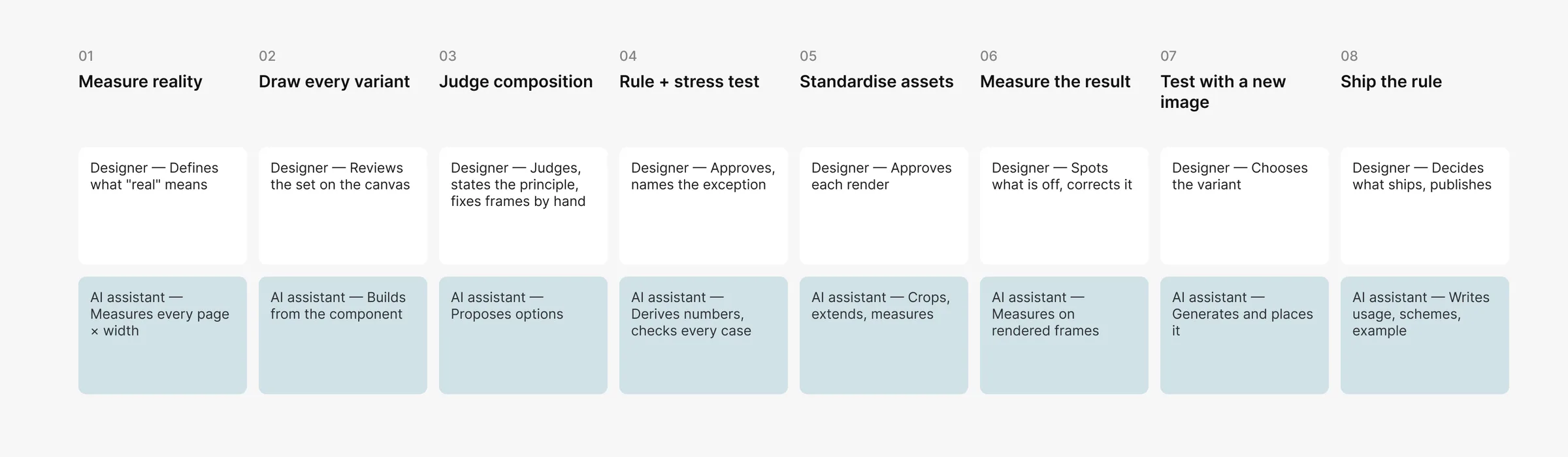
| Step | Designer | AI assistant |
|---|---|---|
| Inventory of real content and sizes | defines what “real” means | measures, tabulates |
| Variants in Figma | reviews the set on the canvas | builds from the component |
| Composition | judges, states the principle, fixes frames by hand | proposes options |
| Rule | approves, names the exception | derives numbers, checks every case |
| Assets | approves the look of each render, chooses variants | crops, extends, measures |
| Design system | decides what ships, publishes | writes usage, schemes, examples |
What I would tell a team adopting this
- Start from data. The first artefact is a table of real cases, not a frame.
- Corrections are the input. A designer’s two-minute fix on three frames is worth more than a long brief.
- Every rule gets a stress test. Ask where it breaks; turn breaks into rules, not exceptions — and write down the conditions under which it holds.
- Standardise inputs. If every asset follows one spec, the code needs one formula.
- Test with something new before calling the pattern done.
The value of AI here was not generating the design. It was checking design decisions quickly against far more scenarios than anyone would check by hand — 40+ pages, five widths, every render — and showing exactly where a decision breaks. That moved my time away from placing objects and towards the parts that need a designer: systemic thinking, the quality of the composition and the decisions themselves.