The Challenge
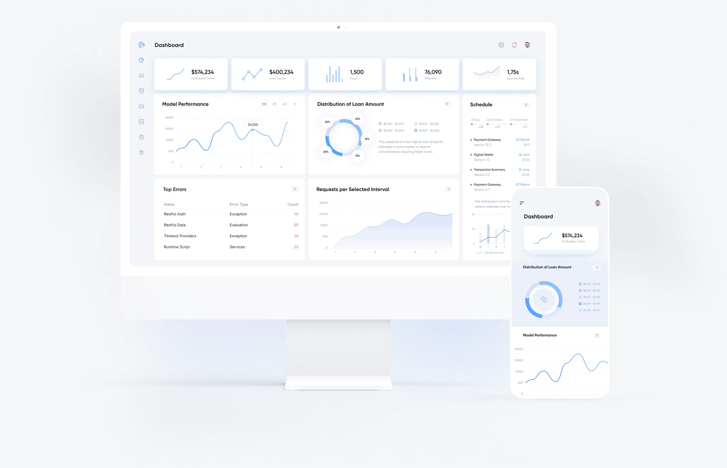
Zoral builds a platform for lending, banking and finance operations. By the time this project started, the business had changed how it wanted to be understood, and the website had not followed. The old site led with being an “AI-native financial operating system” and with the risk of replacing a bank’s core, listed capabilities densely, stated large results without qualification and sent visitors to a PDF business case as the main call to action.
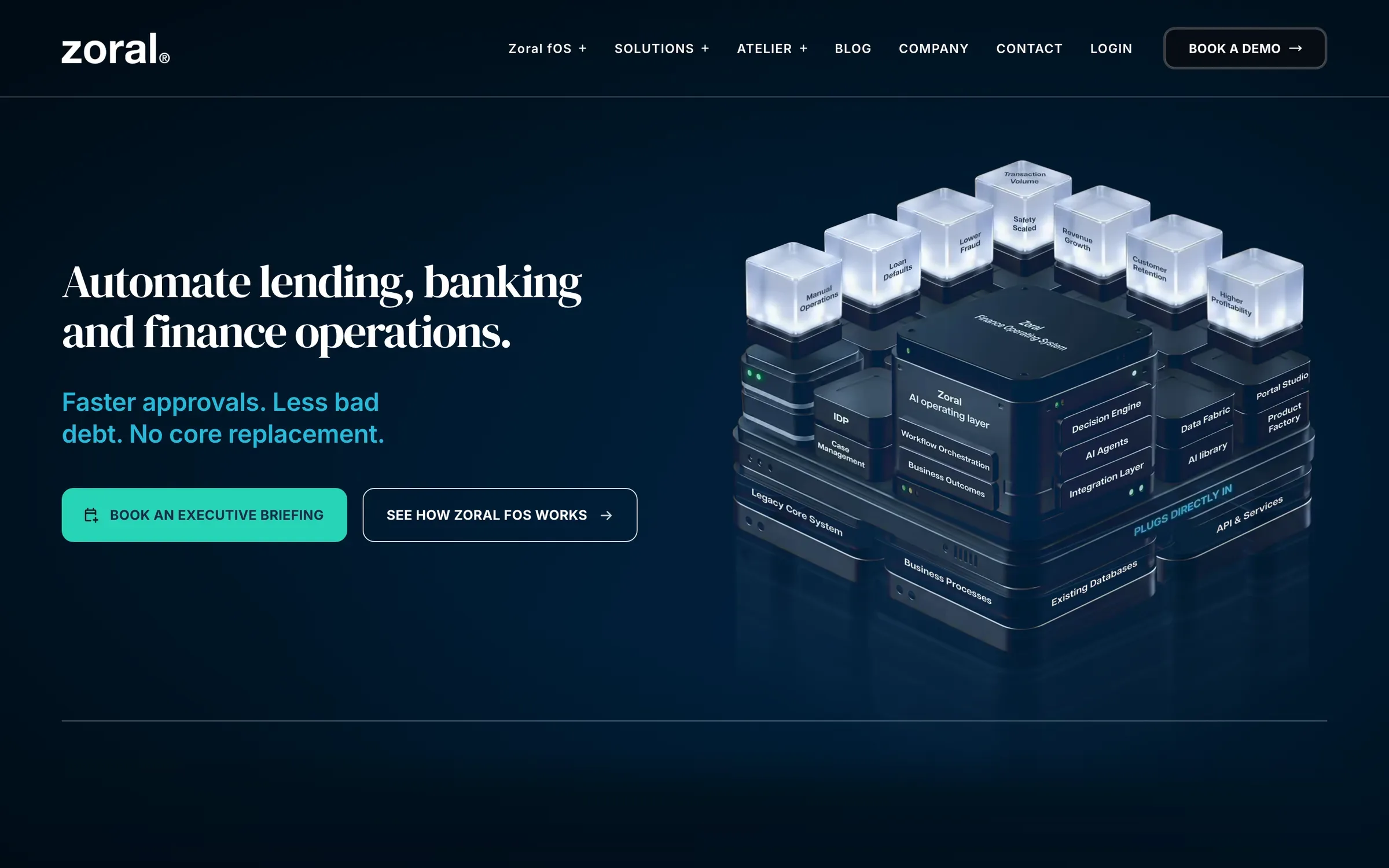
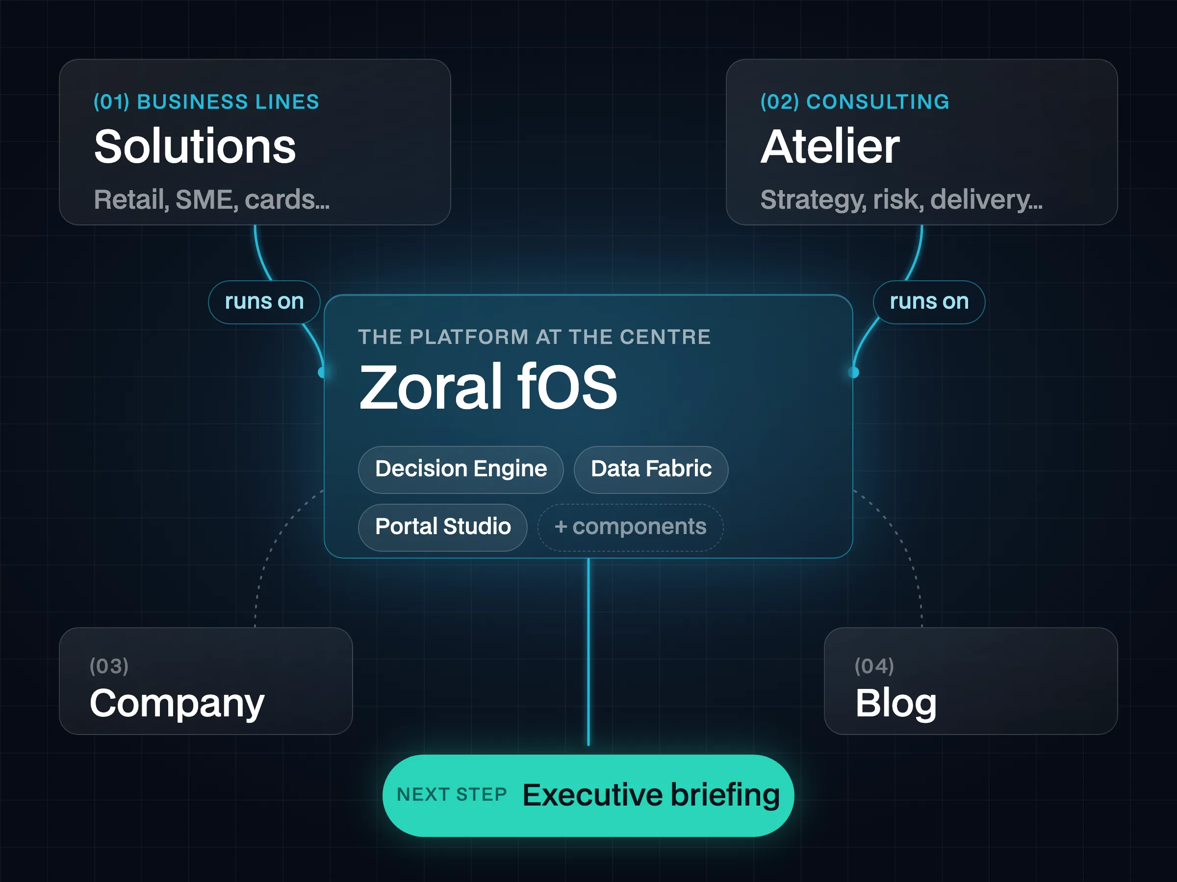
The new direction, set by the business, was plainer: outcomes a bank cares about (“Faster approvals. Less bad debt. No core replacement.”), one platform at the centre with solutions and services around it, an executive briefing as the main action, and results stated as “up to” with a caveat. The copy came from the business. My job was to give that message a structure, a presentation, a visual language and a system that would hold it across the whole site.
Three needs shaped the work:
- Show the company differently. The site had to express the new focus, not just carry new words.
- Make the platform visible. The platform is abstract; buyers needed to see its modules and how they fit together.
- Refresh the visual style. The business asked for an update, and I proposed a new, more premium direction.
The copy and approvals came from Zoral’s leadership (CEO, CCO); the CTO and Architect reviewed the technical side; DevOps ran the deployment.
From Old Site to Wireframes
The old site had no centre: the platform, solutions and services sat side by side, with no clear link between them. Pages were dense lists of capabilities rather than an argument a bank could follow — problem, solution, proof, next step — and each page was assembled its own way, without shared templates for its family. The main next step was downloading a PDF, with no clear path to a conversation with the team.
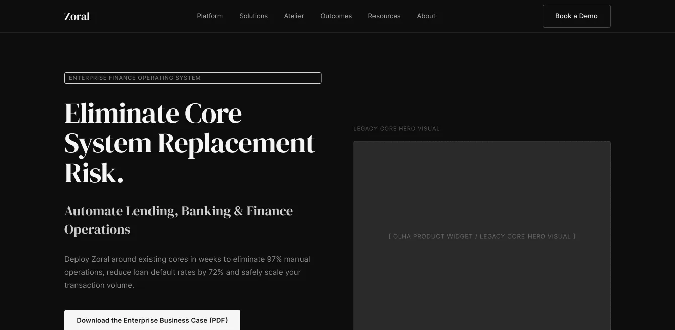
I started from structure, not style. Wireframes of the new site set the order of the argument on each page — what a bank needs to hear first, where the platform appears, where the next step sits — before any visual decision was made.
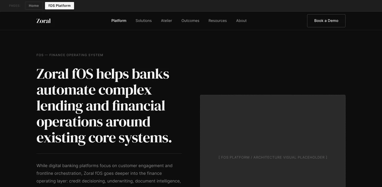
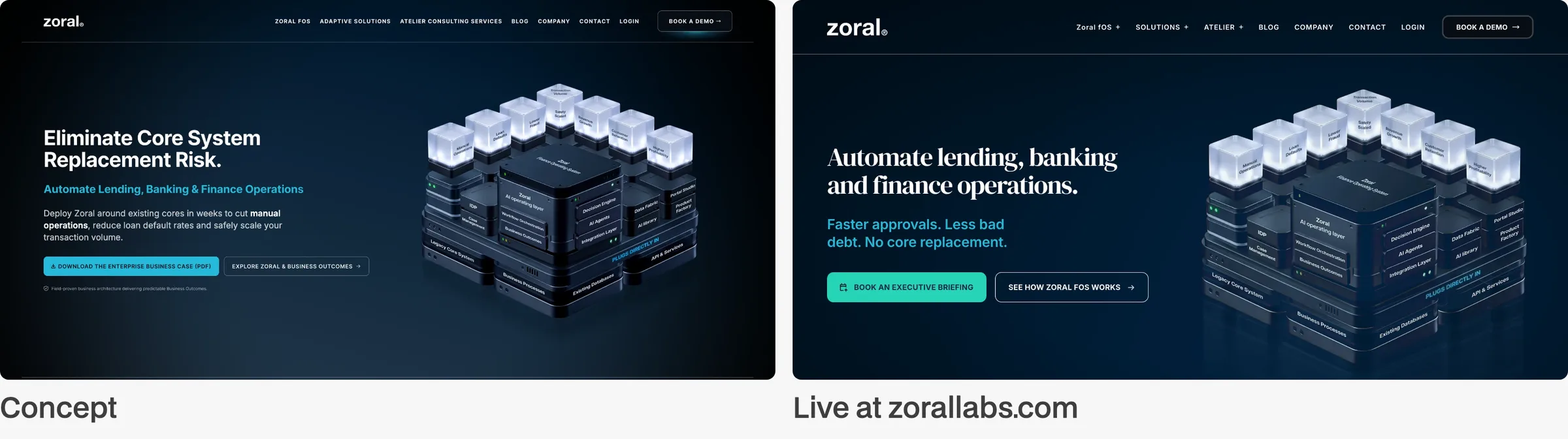
The Concept
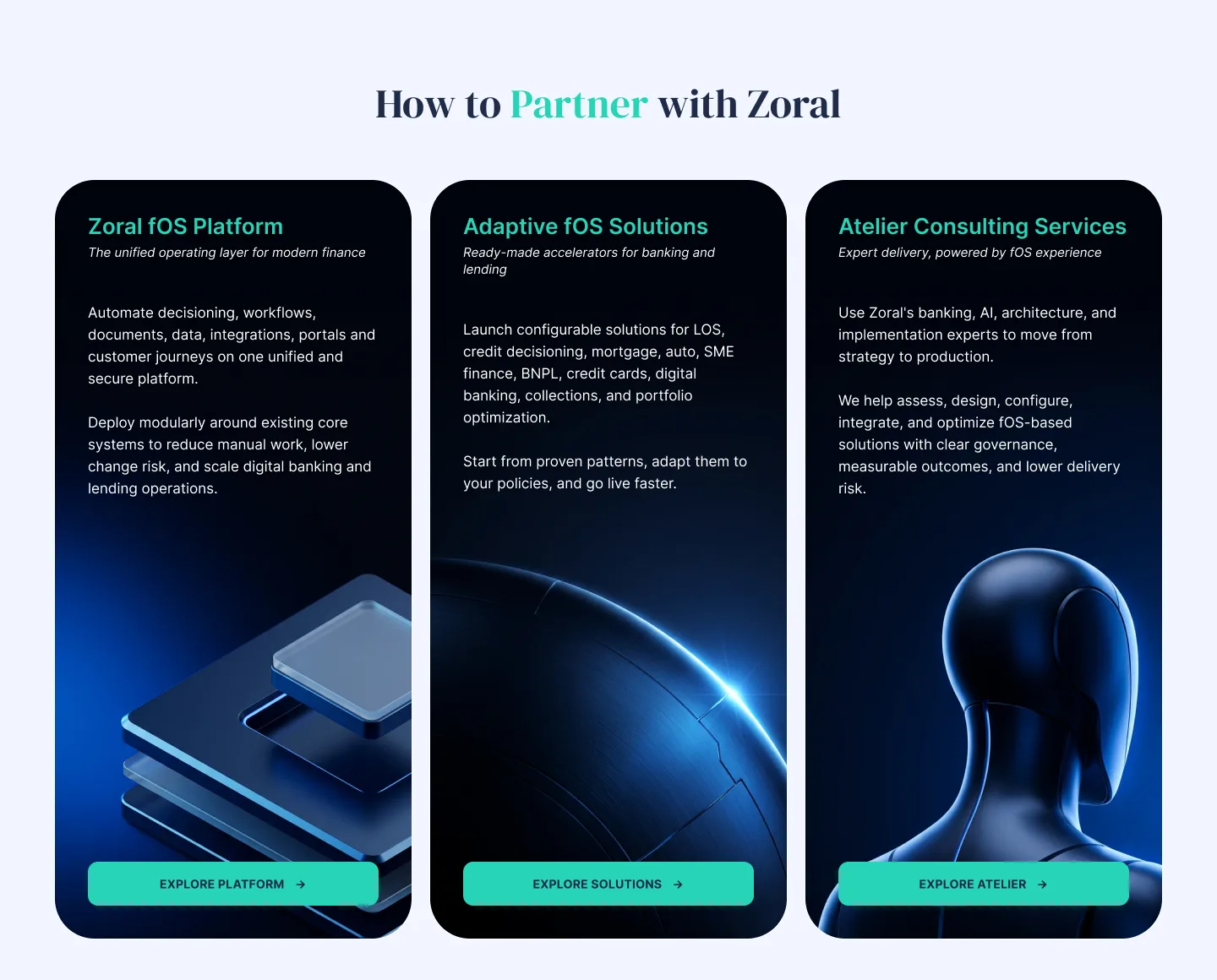
The concept covered the key page families: the home page, the platform (Zoral fOS) and its components, the portal, the AI layer and the solutions. It fixed how each family tells its story, so that later pages were variations of a known pattern rather than new layouts.
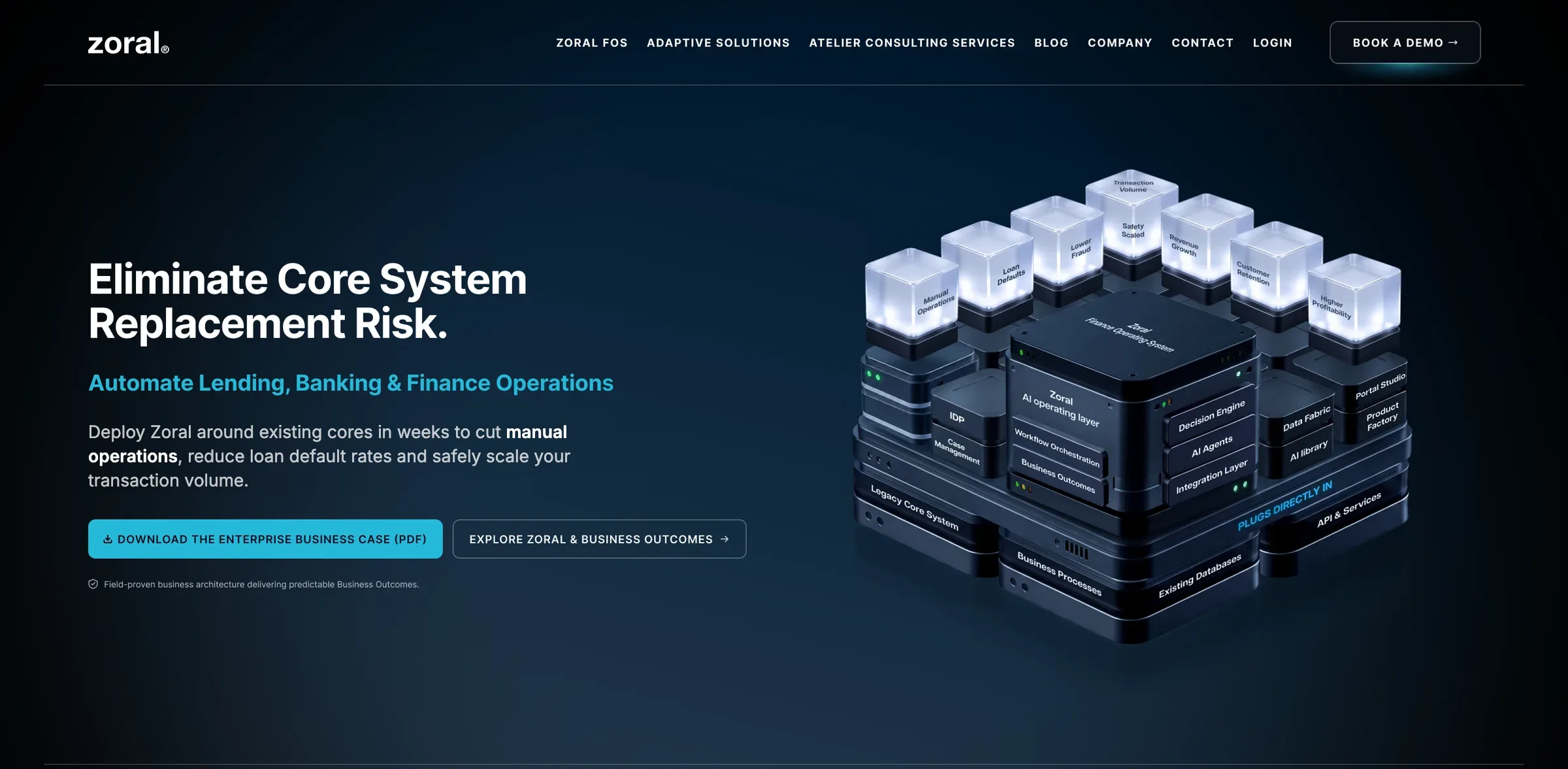
A Premium Visual Language
I proposed one direction, Graphite & Glass: graphite and glass materials, and a calm rhythm of dark and light sections. The materials carry the “premium, engineered” feel the business asked for; the rhythm keeps long pages readable and gives each section a clear start and end.
Each material says something to a bank. Graphite is restrained and engineered: the platform reads as serious infrastructure, not a start-up. Glass shows what is inside the system — modules, data, decisions — which matters to a regulated buyer. Together they place Zoral next to large enterprise vendors rather than among typical fintech sites. The same materials run through the interface and the 3D modules, so the site and its renders read as one whole.
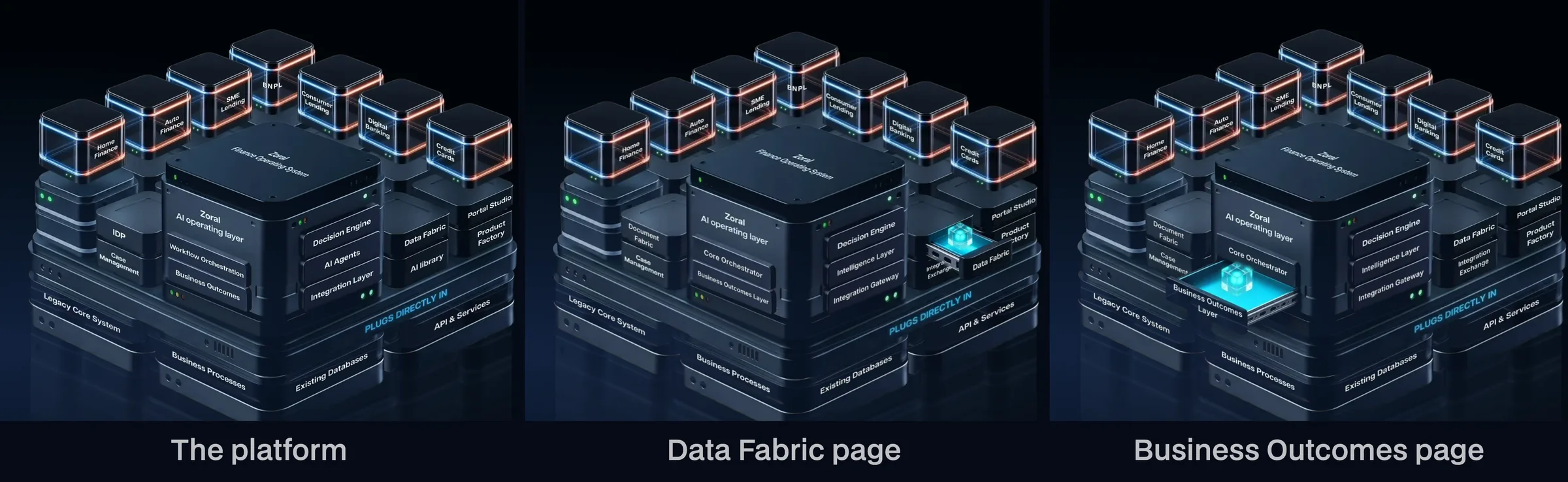
Showing the Platform: Modules in 3D
An abstract platform is hard to buy. I made it a single object: one 3D model stands for the whole platform, and the highlighted module shows what each page is about — the cube on the platform pages, the hub on the home page. A buyer moving between pages sees the same object from page to page, with a different part lit.
This section covers the design decisions only.
Information Architecture for an Enterprise Buyer
The structure follows the new message: the platform is at the centre, and everything else connects to it. The menu and the page families mirror that — platform components, solutions by business line, Atelier services, the company and the blog. Each solution and service page points back to the platform it runs on, so a buyer who enters through one product still understands the whole.
The platform the site sells includes the Decision Engine, whose product design is a separate case: Decision Engine.
From Concept to Rules
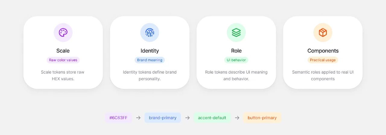
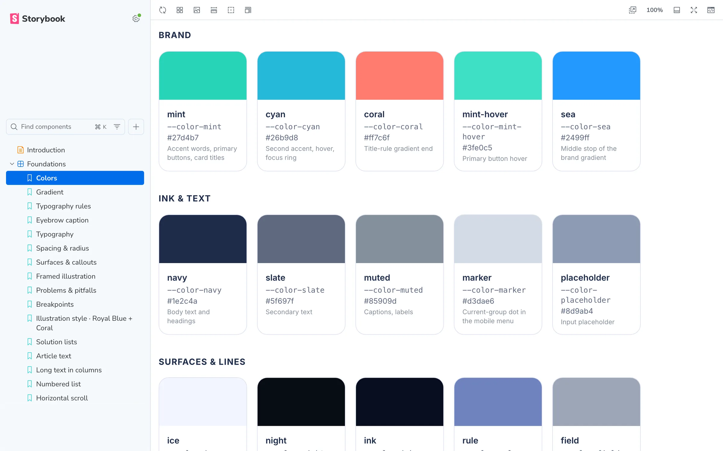
A concept only scales if it becomes rules. I translated it into tokens for colour, radius, spacing and type, then into components and patterns in code, with Storybook as the reference everyone checks against. From that point on, a new page is assembled from the system, not drawn.
A Figma Library Built From Code
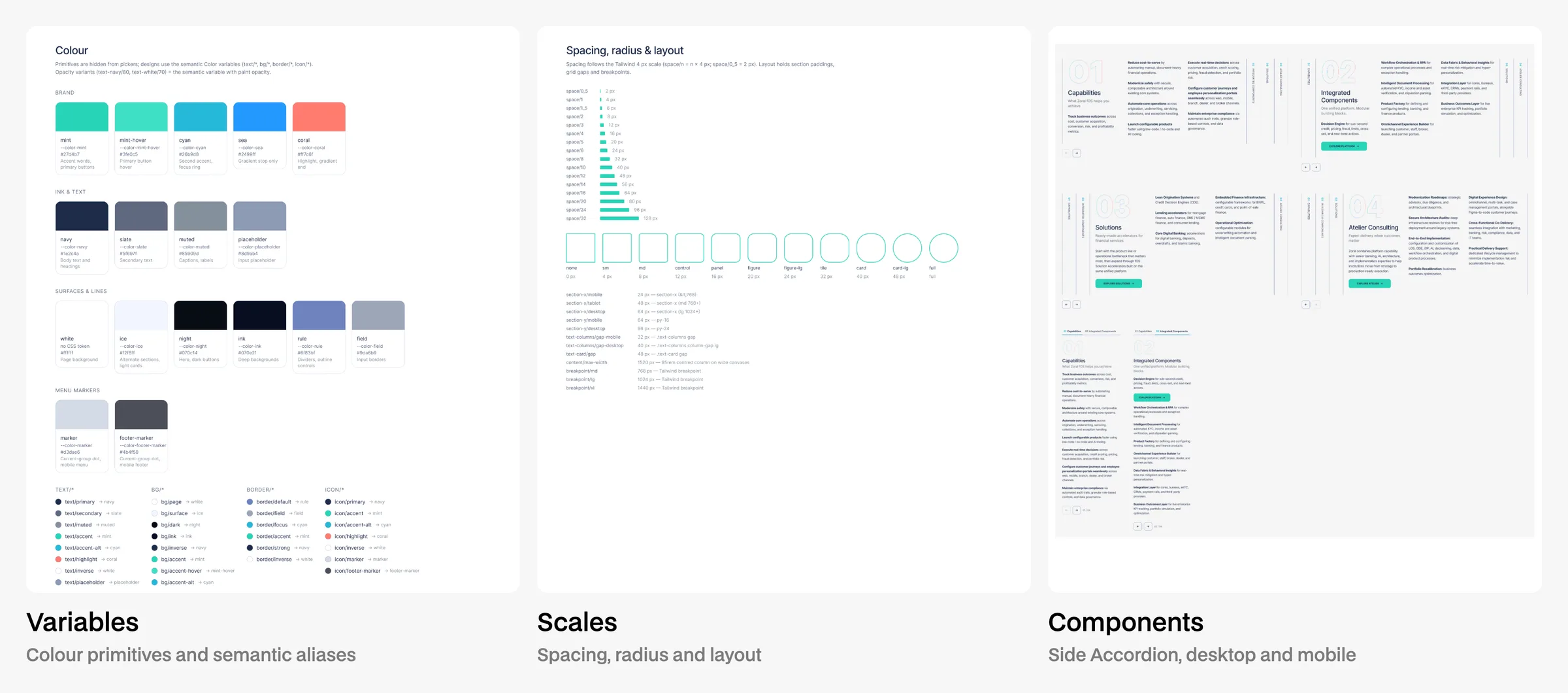
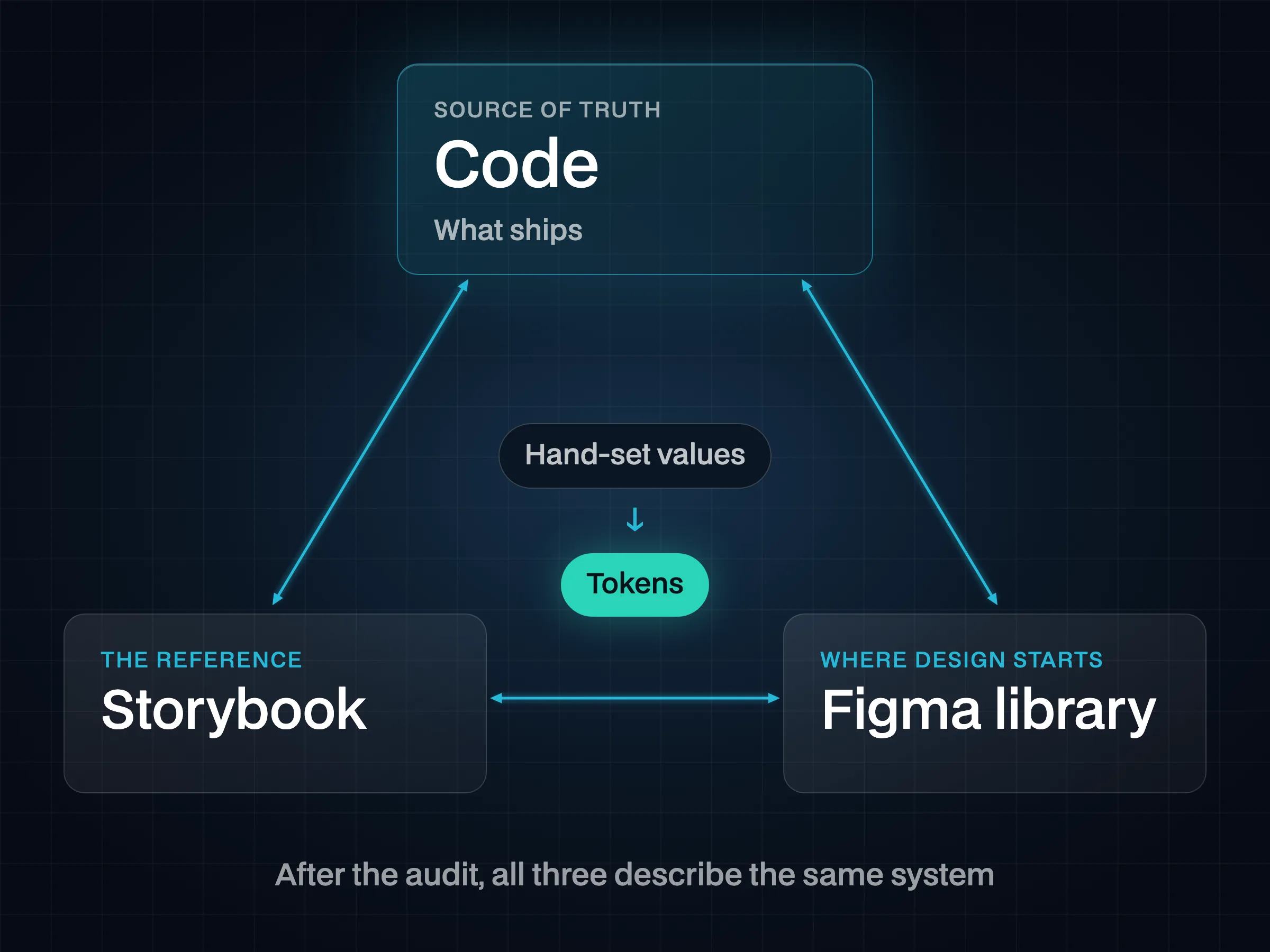
The Figma library was rebuilt from the code, not the other way round. Code is what ships, so it became the source of truth; the library mirrors it — variables, styles, components and block patterns — and design work starts from what already exists in production.
Auditing the System
I audited the code against Storybook and the library. The audit found hundreds of hand-set values; they were replaced with tokens, so the three sources now describe the same system.
Patterns That Hold on Every Page
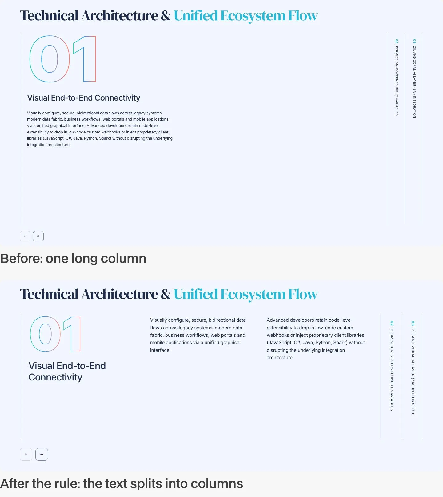
Each recurring block got one rule that holds on every page and at every width: accordions, the closing banner, numbered lists, cards. The closing banner is the clearest example — designed once on short copy, it broke wherever the real copy was longer, until a rule replaced the hand-placed mock-ups. The full story is in the article From hand-placed mock-ups to a pattern with rules.

Impact
The site went from plan to launch in about two weeks and is live at zorallabs.com: 65 pages built from one system. New pages, longer copy and new renders follow the rules without a designer re-placing them by hand.
Related: Decision Engine.